

Where florals become fine art
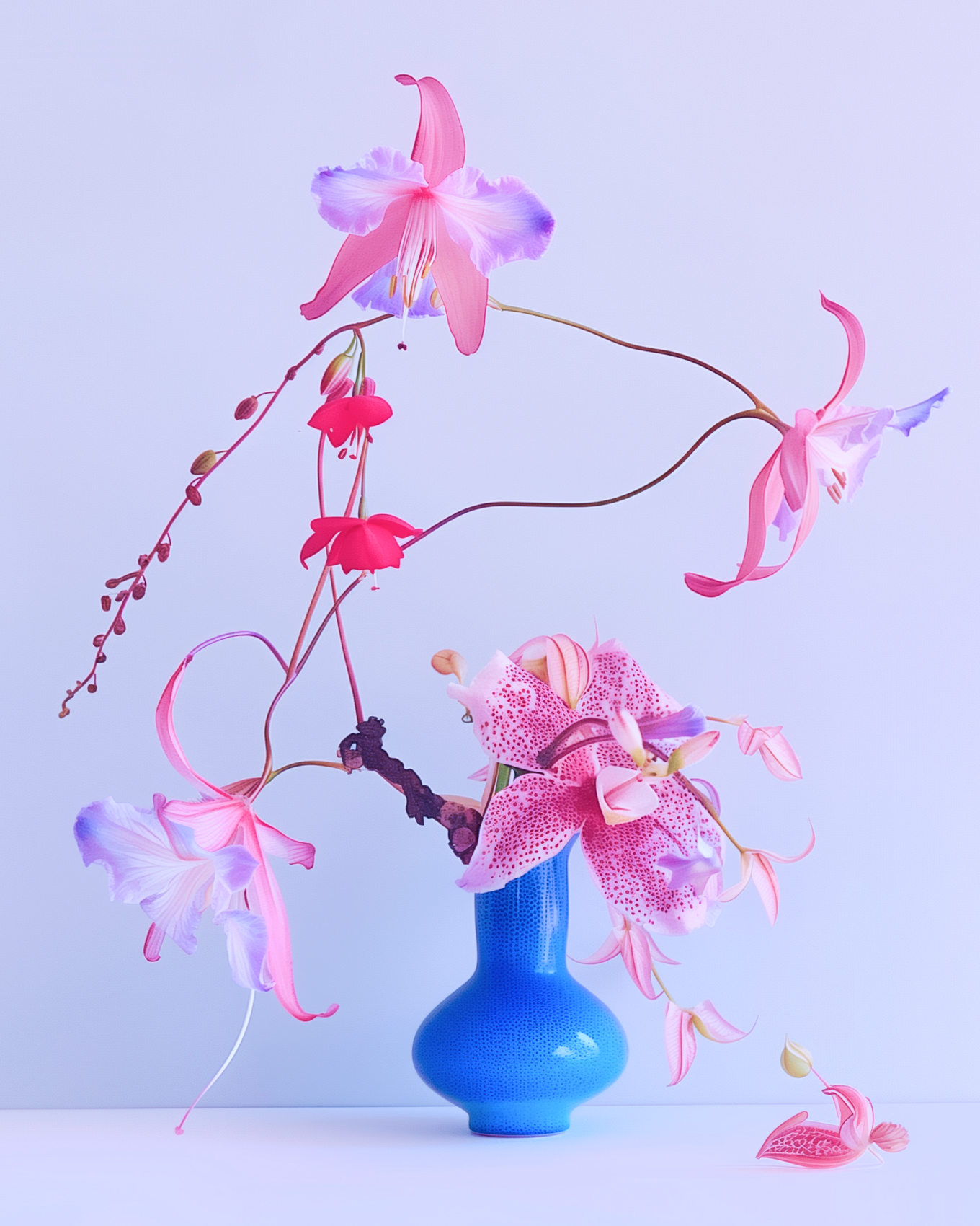
Kvitka — Ukrainian for flower — came to us with a clear conviction: that flowers are not decoration, but art — each stem a brushstroke, each arrangement a composition. Founded in Charleston by a Ukrainian florist with a deep love for wild meadows and their untamed beauty, the brief was to build a brand that could hold that vision with the same intention the founder brings to her work.
The strategy was built around a single idea: florals as art — positioning Kvitka as a creative practice that finds beauty in imperfection and treats the natural world as its medium.


Every detail, in full bloom
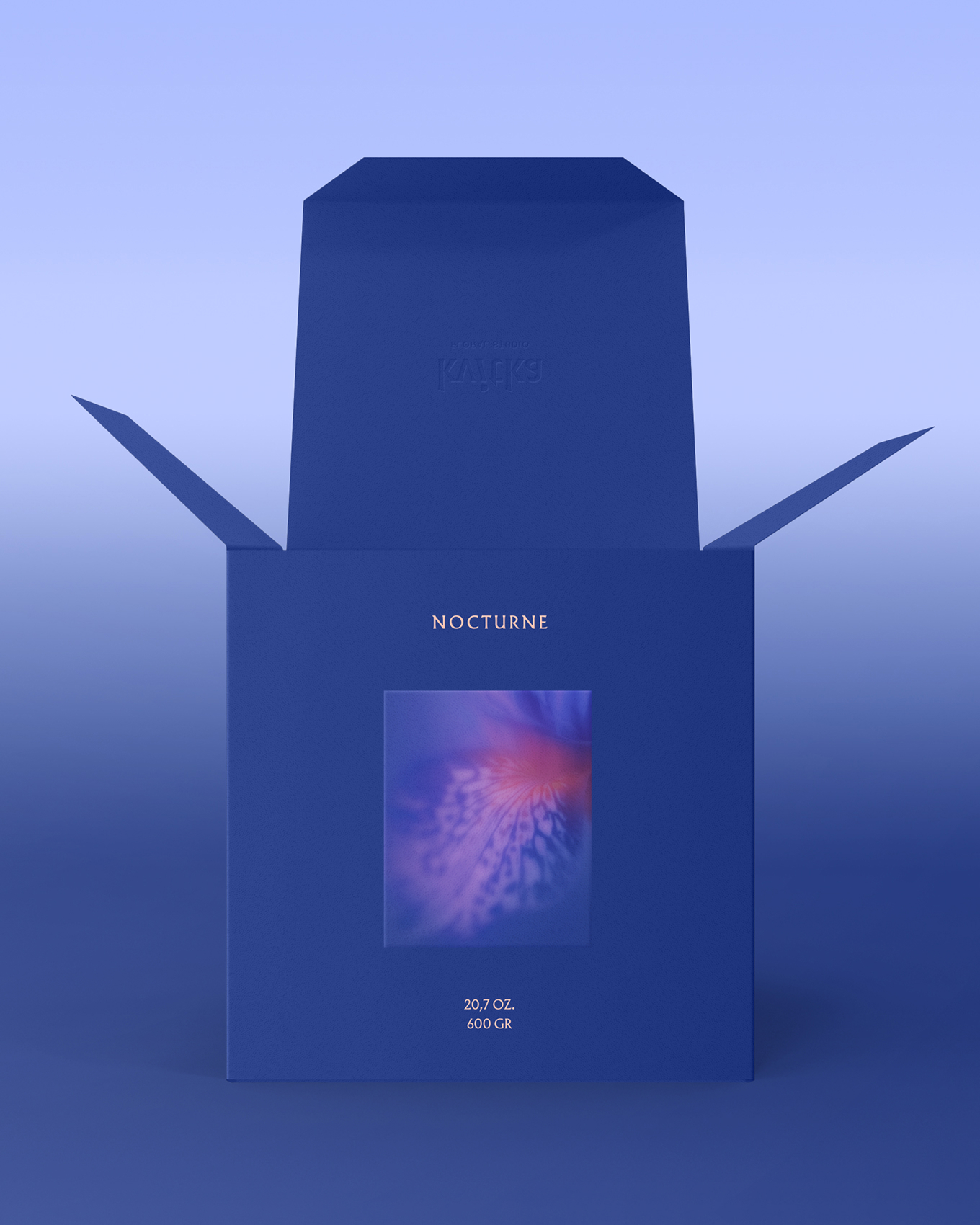
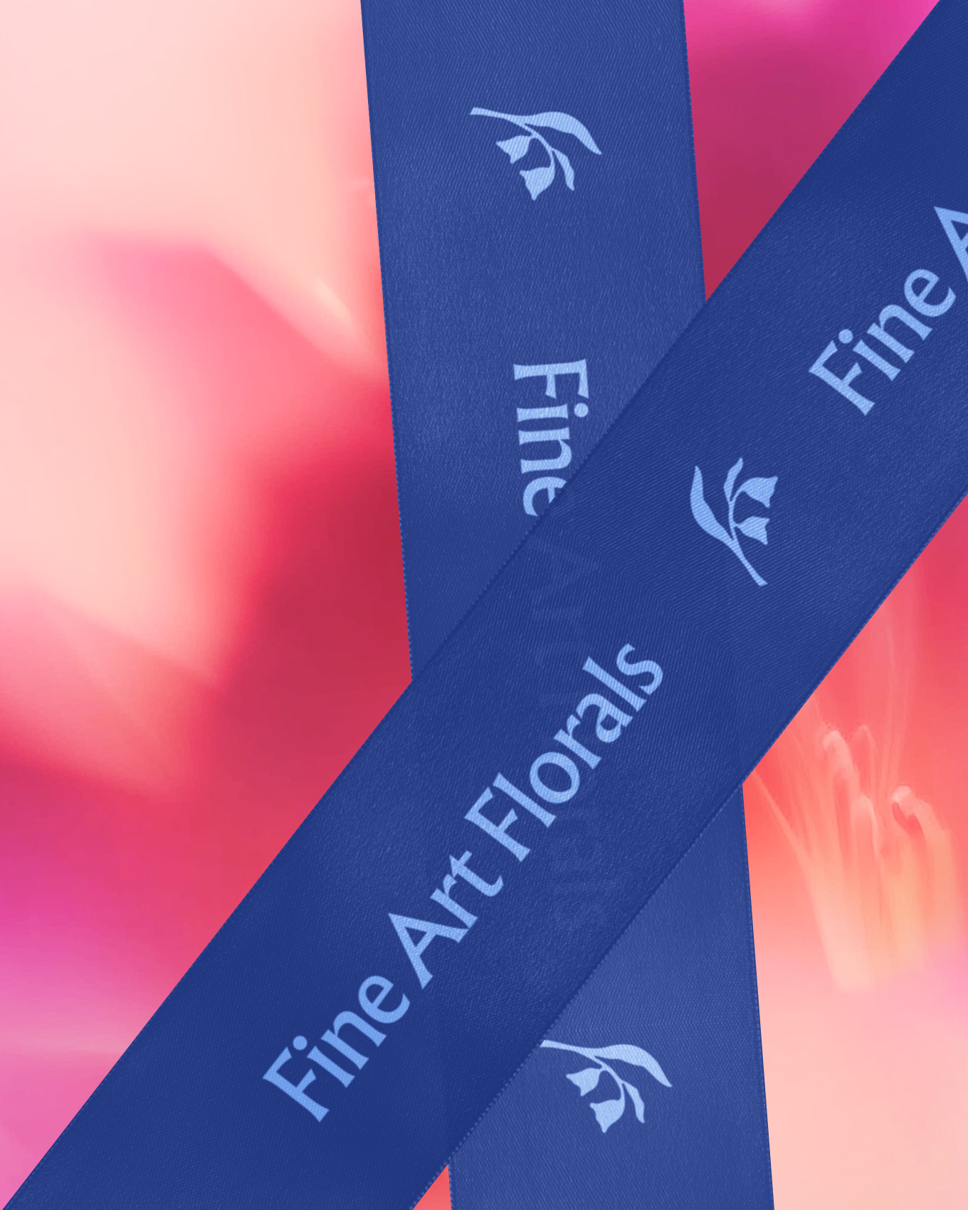
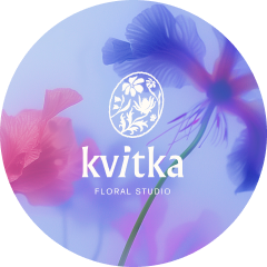
The identity draws directly from the meadow. The colour palette — midnight iris, bluebell haze, soft blush — mirrors the layered tones of wildflowers in bloom, while the logo stamp brings together the founder’s favourite flowers in a single botanical composition.
The logotype carries the same spirit: a broken rhythm with the i set at an angle, evoking the natural lean of a wildflower stem, its dot drawn in the shape of a petal — imperfection elevated into intention.
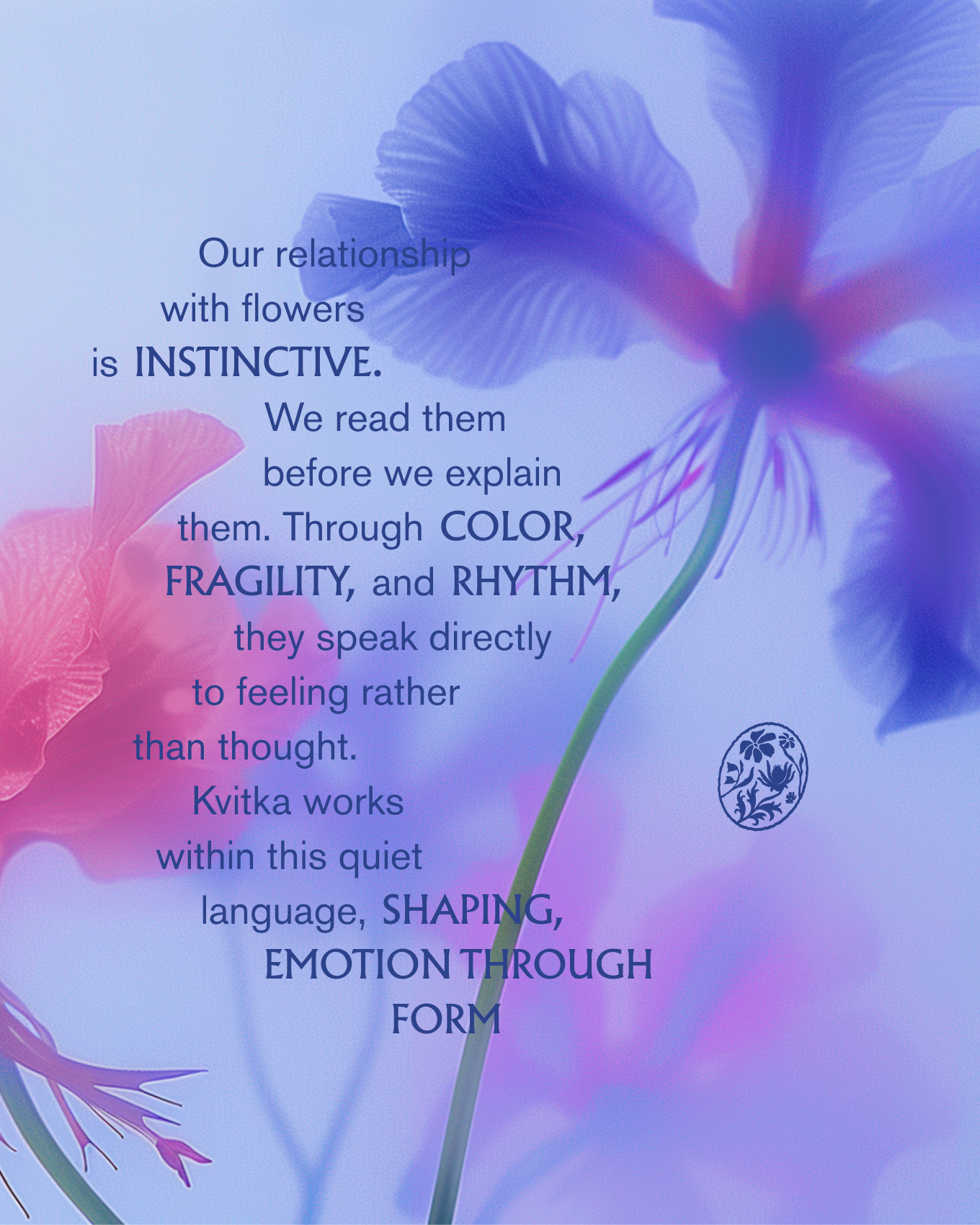
AI-assisted visuals take the visual language further — petals dissolving into abstraction, colour bleeding beyond the frame — always through the same unhurried, poetic lens.